Collector's Corner
HEIR APPARENT: The Evolving Art of Kaa Folwell
Jul
I first met Kaa Folwell, not as the serious artist she is today, but as a teenager who was helping her aunt, Susan Folwell, at the Heard Indian Market and I marveled that, although she would be standing all day on uneven ground, much of it gravel, she was sporting stiletto heels. I was immediately drawn to Kaa because she reminded me so much of my niece Amanda, who is also a fashionista. I sensed that they both had the same philosophy: “No matter what one is doing, the important thing is to look good doing it.” Over the course of many years, Kaa became a young woman, a mother, and developed into an artist who is passionate about her art. It is a joy to watch her continue to evolve. Kaa Folwell has learned from the best – her grandmother, famed ceramic artist Jody Folwell; her aunt, Susan Folwell, a celebrity in her own right; and, of course, her mother, Polly Rose Folwell. She could not have asked for better mentors.
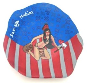
Savage Nation by Kaa Lazaro, Santa Clara Pueblo, ceramic plate with acrylic paint, 10” in diameter at widest point (2012). Collection of E. J. Guarino.
The very first piece I acquired by Kaa Folwelll was Savage Nation, which I feel is very powerful, especially being created by someone so young at the time. However, according to the artist, quite a number of people who viewed this work completely misinterpreted its intent, mistakenly thinking she was stereotyping Native woman. Some even found the pice offensive. However, the artist had something quite different in mind. The figure at the center of the plate is being served up just the way Americans like – scantily clad, wearing “war paint,” holding a tomahawk, staring defiantly out at the viewer and poised to attack. However, on closer inspection, the tomahawk is piercing a heart and in the figure’s left hand the “warrior” holds a sack bearing the words “Bag of” followed by the image of a broken heart. Between the two parts of the heart is a dollar sign. This figure represents the way Native people – both male and female – have been viewed by mainstream culture and portrayed in the media as violent and overly sexual. It is an image that is, for many, both frightening and titillating. The key to this work is the artist’s use of the colors red, white and blue, though within the blue are marks known as Santa Clara crosses. The imagery, colors, and the words Savage Nation, make it clear that the viewer is being challenged to reconsider long held beliefs about Native people and the United States, leaving us to wonder who actually are the savages.

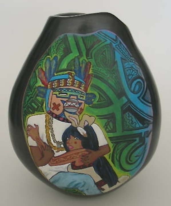
Dawnee Darko and Rez Bunny by Jody Kaa Folwell, Santa Clara, acrylic paint, 9“ h x 22“ in circumference (2014). Collection of E. J. Guarino.
Dawnee Darko and Rez Bunny reverse side.
A few years later, I marveled when I saw Kaa Folwell’s Dawnee Darko and Rez Bunny: Forbidden Love and instinctively knew it was an important piece. Kaa explained the title: “I spell it Dawnee because it rhymes with Pawnee even though the Pawnee Nation doesn’t have a belief system around katsinas . . . . It’s just the Native version in my mind of Donnie [Darko]. My grandmother has a Hopi katsina that I modeled the Dawnee mask after.”
When asked about the inspiration for the piece, the artist stated, “. . . in Tewa belief women aren’t supposed to touch katsinas and vice versa. Dawnee and Rez represent forbidden love . . . it’s the whole look but don’t touch concept.“
The background, which is based on graffiti designs, and the use of the colors yellow, green, and blue, add to the tension of the piece.
Kaa Folwell clearly knew that her piece was controversial for a number of reasons besides the katsina and female embracing. Rez Bunny sports a tattoo on her arm, something frowned upon by the elders of Santa Clara Pueblo. “Both Dawnee and Rez” Kaa added, “are also bringing the traditional and the modern together,”. “You can see this with Dawnee’s attire and with Rez you see the pink lipstick and the red tattoo and nails. The actual vessel can be viewed two different ways: traditional and contemporary. To get the traditional view, turn the side with the imagery to the wall. . . . Again, this goes along with the new and old, the ‘traditional and contemporary.’” Kaa Folwell clearly has her own unique artistic vision.
 |
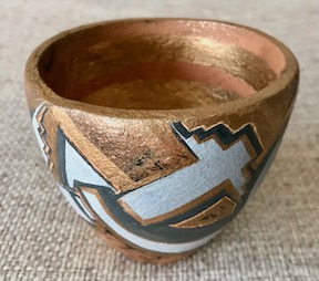 |
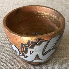
Carpenters’s Cup by Kaa Folwell, Santa Clara Pueblo, 3.5” h x 3.5” in diameter at mouth (2019). Collection of E. J. Guarino.
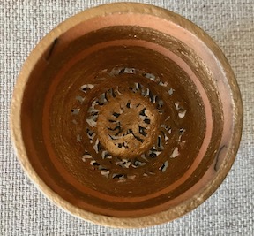
Carpenters’s Cup (interior).
Carpenter’s Cup, the title of a small work by Kaa Folwell, intrigued me as did the piece itself when I first saw it. The title of this diminutive clay cup could be a reference to the cup Jesus drank out of at The Last Supper, or it could be an allusion to the Holly Grail, another name for the cup used by Jesus, found in the movie Indiana Jones and the Last Crusade. Of course, it could represent something entirely different so, at the time, I Emailed Kaa Folwell. Her response was priceless and “so Kaa”: “Honestly, I don’t remember what I was thinking . . . . Maybe I had watched Mel Gibson’s movie about Jesus [The Passion of the Christ] . . . . I don’t think that was the case. I really don’t remember. . . .” Carpenter’s Cup is not one of the artist’s favorite pieces, but I was immediately drawn to its rough-hewn quality. If this little ceramic vessel is, in fact, in someway a reference to Jesus it would make perfect sense since, rather than drinking out of a jewel-encrusted chalice, He wold most likely have used a crude ceramic cup at the Passover meal.
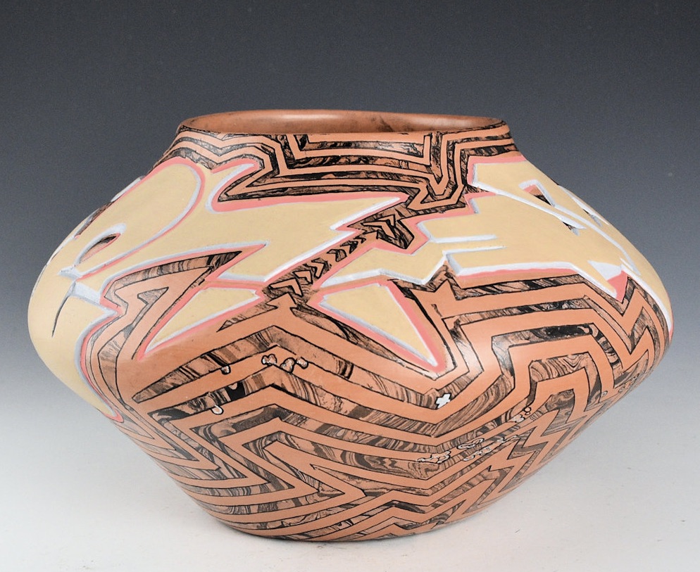
Carved Avanyu Jar by Kaa Folwell, Santa Clara Pueblo, 9″ w x 6″ h (2024). Collection of E. J. Guarino. Image courtesy of King Galleries.
I just happened to be sitting In King Galleries during the 2024 Santa Fe Indian Market when Kaa Folwell’s Carved Avanyu Jar was brought it. It immediately caught my eye so I asked Charles King which artist had made it. He said, “Kaa Folwell” and I responded with one word: “Sold!”
I was very curious about the piece and, when it arrived, I Emailed Kaa to ask her what had inspired her to create it. She said that she had been influenced by many different pieces of her grandmother’s work, believing that this work was “very Frankenstein” and added some technical details: “The pot was stone burnished with natural clay, the marbling lines were created by hydro dipping marbling acrylics – the lines were also cleaned with an acrylic paint pen. On the bottom there’s all these little chrome specks, that was done by a chrome paint pen. The little specks . . . happened when I was peeling off the masking tape . . . I used to help make the lines and the tape ended up peeling off some of the polishing, leaving all these little rough specks. The Avynu, water (protector/bringer) serpent, was painted with acrylic paint (beige and pinky coral color), the grey is acrylic ink.”
For me, one of the best aspects about being a collector is being able to contact an artist whose work you have acquired and learn more about how and why it was created.
 |
 |
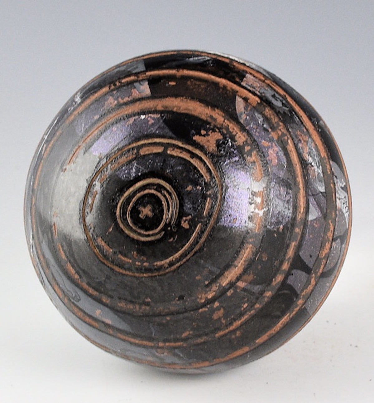
Waves Seedpot (Earth Balance Series) by Kaa Follwell, Santa Clara Pueblo, 4”w x 3.75”h (2024). Collection of E. J. Guarino. Images courtesy of King Galleries.
 |
 |
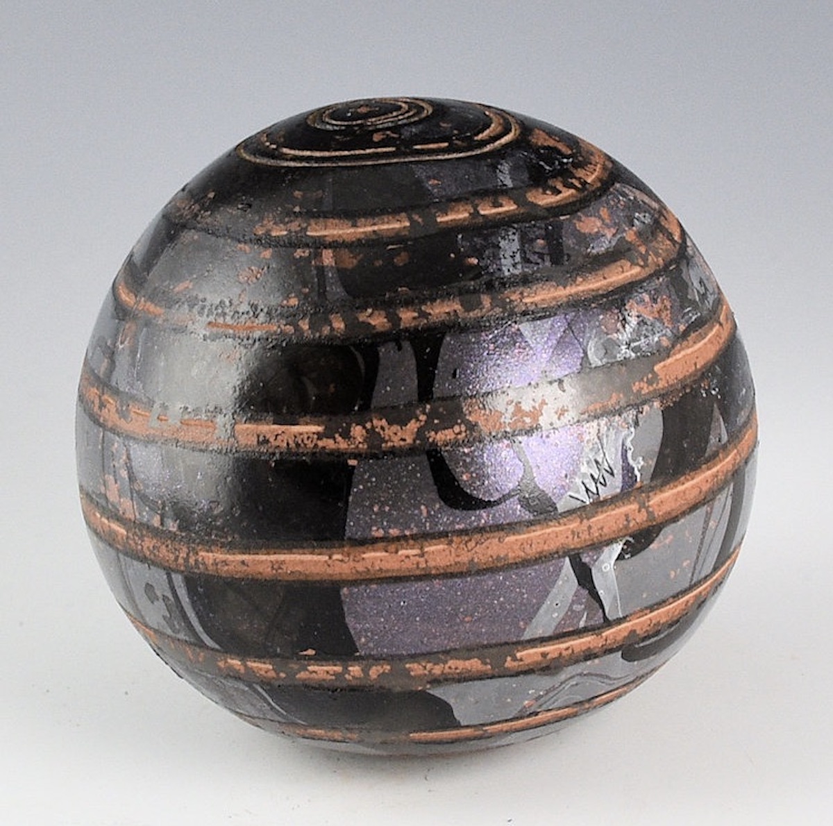
Rain Seedpot (Winter Solstice Series) by Kaa Folwell, Santa Clara Pueblo, 4.5”w x 4”h (2024). Collection of E. J. Guarino. Images courtesy of King Galleries.
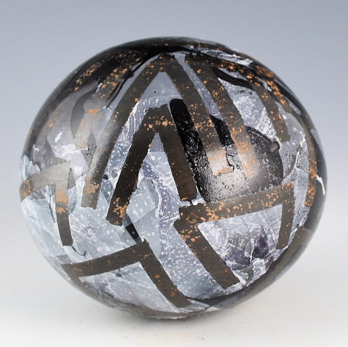
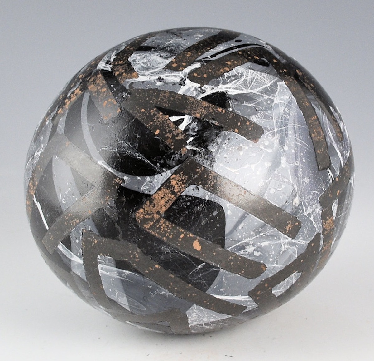
One of Kaa Folwell’s most recent projects was a multiple of series, which consists of ceramic spheres (based on the Pueblo seedpot form) she refers to as “balls.” These modernistic works actually do look more like ceramic balls than traditional seedpots, though that word is used in the titles. In her own inimitable and humorous way, Kaa had much to say about these works: “Okay, so with the balls, they were such a pain in the end to work on. In the beginning I thought they could possibly be morphed into a sculptural piece with the series of balls (but the King [here she means Charles King] was not amused). I had attempted to burnish the pieces like the ultra gun metal pottery of Mata-Ortiz. However I couldn’t quite get the slip to not peel off. So I ended up pivoting and getting funky with each piece. I had stopped working on them and shoved them in my utility closest for almost a year. I did start them during the time there were all these eclipses happening and finished them during this period of special celestial lunar happenings in November and December of this last year [2024].”
The imagery on Kaa Folwell’s contemporary take on seedpots is made up of abstract patterns with a stark contrast between background and foreground. The designs have the quality of 3D Op Art, which makes the viewer want to reach out and touch them. These works are an exploration of form, color, and line. For the Waves Seedpot (Earth Balance Series) a red eaten color was used in contrast to the black background. For the Rain Seedpot (Winter Solstice Series) a design of a dark gray linear grid was used over a background that utilizes black, blue, and white.
The work of Kaa Folwell continues to evolve. As a collector, it has been gratifying to watch her learn the technical aspects of ceramic making and combine them with her willingness to explore and experiment in terms of technique, materials, form, and theme. Kaa Folwell has been taught well by her grandmother, mother, and aunt. However, she is very much her own person and, although mentored and inspired by these three family members, Kaa has her own unique artistic voice. It has been an honor to watch her grow, both as a woman and as an artist.