Collector's Corner
ONE PLUS TWO: The Annual Cape Dorset Print Collection Past and Present
Oct
For over twenty-five years, collecting Inuit works on paper has been an exciting and often exhilarating experience. Of course, the high point of each year is the release of the Annual Cape Dorset Print Collection. This year the collection contains twenty-seven works in a variety of print media – stonecut, stonecut & stencil, linocut, lithography, and etching and aquatint. The prints are produced in editions of fifty each. On rare occasions one or two prints are done in a run of one hundred. Anticipation is always high among collectors in Canada, the U.S. and Europe. For more than fifty years, Cape Dorset has consistently been able to attract and maintain a large group of international collectors. This is due in large part to the support of the West Baffin Eskimo Co-operative, the marketing and promotion done by Dorset Fine Arts and, most importantly, the willingness of the Cape Dorset artists and printers to embrace creative and technical innovation and experimentation. The quality of Cape Dorset prints is always artistically exceptional, which makes deciding which works to acquire a challenge. In some cases it is possible to overlook a work only to “discover” the print a few years later.

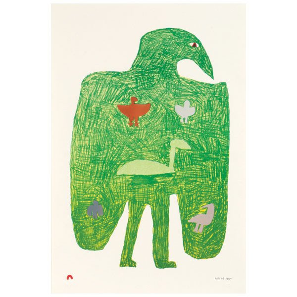
Latchaolassie’s Birds by Saimaiyu Akesuk, Inuit, Cape Dorset, Lithograph edition /50, Printer: Niveaksie Quvianaqtuliaq, Paper: BFK Rives White, #24 in the Cape Dorset Print Collection, 22.5” x 15 (2013). Collection of E. J. Guarino
This is exactly what happened with Latchaolassie’s Birds by Saimaiyu Akesuk, which was part of the 2013 Annual Cape Dorset Print Collection. At the time of it’s release, I had somehow failed to take notice of it. However, that changed when I was recently at the Museum of Contemporary Native Arts in Santa Fe to see Akunnittinni: A Kinngait Family Portrait—Pitseolak Ashoona | Napachie Pootoogook | Annie Pootoogook, an exhibition of eighteen Inuit works on paper. Concurrent with this show is Telling a Story: Inuit Works on Paper, an exhibit and sale of prints by a wide range of Inuit artists. As I rounded a corner, I came upon Latchaolassie’s Birds and stopped dead in my tracks. I was astonished by the quality of the print, a lithograph. It was so fine that it could easily be mistaken for a drawing because of the strokes of color moving in different directions that are clearly visible. Unfortunately, such subtleties are lost when viewing works of art on a computer screen. When I looked at the year of production I was shocked. It had been part of the 2013 Annual Cape Dorset Print Collection but somehow I had missed it. This time I was not going to pass up the opportunity to acquire such a wonderful work of art and I immediately bought the print.
Not only was I attracted by the technical excellence of this print, I found it delightfully humorous, a hallmark of Saimaiyu Akesuk’s work. The print is an abstracted representation of a brightly colored bird. The figure is large, bold, and decidedly humorous. The green bird with human legs has a downcast look as if he or she is carrying the weight of the world. Indeed, the figure is carrying something – five other birds. Reminiscent of Big Bird, the image is at once silly and sad and it fit perfectly with other works I have by this artist.

Red Walrus by Tim Pitsiulak, lithograph , /50, Paper: Arches Cover White; Printer: Niveaksie Quianaqtullaq, #2, 29.5” x 41.75” (2016). Collection of E. J. Guarino
Because Cape Dorset prints are always of the highest artistic caliber, selecting which works to acquire must be a careful process. The pieces chosen must be artistically significant but, they must also fit into the rest of the collection. Each year scores of works must be considered. Since, for most collectors, money is always a consideration, only a few prints are usually acquired. After repeatedly looking at the 2016 offerings, I chose two prints that I hope to acquire. The first is Red Walrus by Tim Pitsiulak.
At twenty-nine and a half inches by forty-one and three quarter inches, the print is unusually large. It is a common Inuit printmaking practice to isolate an iconic image of Arctic wildlife on the page but in Red Walrus the figure of the animal, instead, takes up almost the entire sheet, making it visually commanding. Clearly, this is an important animal in the Arctic and one that is dangerous to hunt. However, the artist has chosen to render it in whimsical fashion since the creature seems to be doing the backstroke across the page. The viewer is also left to wonder why the artist created a walrus that is red. Perhaps it was just for humorous effect or it it may suggest that the setting sun has cast a crimson hue on the huge beast. It is also a way of rendering the animal less threatening – in the mind of the hunter and in that of the viewer. Whatever, Mr. Pitsiulak’s reasons for producing a somewhat less than realistic portrait of a walrus, he has, nonetheless, created one that is arresting.

Glowing Kudlik by Ningiukulu Nungusuituk, stonecut and stencil, /50, Paper: Kizuki Kozo Natural; Printer: Tapaungal Niviaqsi, #27, 15” x 23” (2016). Collection of E. J. Guarino
Glowing Kudlik, my second selection from the 2016 Annual Cape Dorset Print Collection, is quite different from Red Walrus, though there is a very subtle similarity. In this print, the artist, Ningiukulu Nungusuituk, has also chosen to isolate an iconic Arctic image in the center of the page. However, in this instance it is an important object rather than an animal. A kudlik is a crescent-shaped lamp most commonly carved from soapstone. It was usually filled with seal blubber (hence the English term seal-oil lamp) or whale bubbler. When the Inuit lived on the land, the kudlik provided warmth and light for their tents and igloos and was also used to melt snow for water, cook food, and dry clothes. For the Inuit, the kudlik was an essential and prized possession.
Rendered in muted tones, the vessel in Glowing Kudlik takes on an almost mystical quality. This beloved object seems to float in mid-air or, at least, on the page. Ningiukulu Nungusuituk has taken a tried and true convention of Inuit printmaking and given it new meaning by presenting a traditional object in a decidedly modernist fashion. The image of a humble stone object becomes infused with layers of meaning – nostalgic, spiritual, primal, quintessential.
The 2016 Cape Dorset Print Collection contains many works that are technically brilliant as well as visually powerful. The excellence of the prints is always thrilling but it makes it difficult to choose which pieces to acquire. I always find the process a bit frustrating but ultimately satisfying. Whether or not I buy a piece greatly depends on whether or not it “speaks” to me. It is only later that analysis comes into play. I acquire works that I feel are artistically significant and never make my choices based on an ethnographic or anthropological perspective. After looking at all twenty-seven prints, I feel that Red Walrus and Glowing Kudlik are the best fit for my collection and that coming upon Latchaolassie’s Birds at the Museum of Contemporary Native Arts in Santa Fe was serendipitous.
To see all of the works in the 2016 Annual Cape Dorset Print Collection go to the following link: http://www.dorsetfinearts.com/2016-annual-print-collection