Collector's Corner
BIRDS OF A FEATHER: Blackbirds, Crows, and Ravens in the Graphic Art of Rick Bartow
Apr
A wide variety of creatures make an appearance in the work of Rick Bartow. Among the most frequent are birds, particularly blackbirds, crows, and ravens, which to most of us are all the same. However, they are not. According to their scientific classification, blackbirds are in the genus Turdus and the family Turdidae while crows and ravens are in the genus Corvis and the family Corvidae. However, all three birds are in the same scientific order Passeriformes. For Rick Bartow, these three birds, along with all the other critters he portrayed, assumed a symbolic meaning in his work. The multitude of animals that Rick Bartow depicted serve an artistic purpose more complex than mere representation: They are usually surrogates for various aspects of the artist’s personality, functioning on a metaphorical and psychological level. With regard to this, the artist stated, “. . . they are me and I am them in observation and lesson.” In Bartow’s art things aren’t quite what they seem to be. The artist often added numbers, letters, and words in Yurok, Japanese, German, or English in his own hand to his works on paper as well as phrases and quotations. He frequently employed a diverse range of curious, enigmatic marks – crosses, circles, splotches, dots, flecks, and smudges. What may appear to be stray marks on the page are not the result of carelessness as one might assume.

How Does It Work – Really? by Rick Bartow, Wiyot, monotype on handmade Japanese paper, 22” x 16” (2007). Image courtesy of the Froelick Gallery, Portland, OR.
In How Does It Work – Really? Bartow quotes the first four lines of “Sing a Song of Sixpence,” the famous Mother Goose nursery rhyme:
Sing a song of sixpence,
A pocket full of rye,
Four and twenty blackbirds
Baked in a pie.
However, Bartow makes one, very important change: the word blackbirds becomes black birds in his monotype. The difference is significant. A blackbird is a specific species of bird while the term black bird simply refers to a bird that is black, including crows and ravens. Whether or not Bartow intentionally used two words instead of the traditional one word in the poem will forever remain a mystery.
The title of the work is intriguing. What did the artist mean when he titled the work How Does It Work – Really? Perhaps he was simply wondering how twenty-four birds could be baked in a pie. Oddly enough, there is actually a recipe in a 1549 Italian cookbook for pies that allowed for birds to be alive inside and fly out when the pie was cut up, providing much amusement and wonder for guests. (I guess there wasn’t much in the way of entertainment back then.)
Beyond what the rhyme might mean, I also wondered if the piece is another of Rick Bartow’s self-portraits. However, although the artist often depicted himself with an enlarged nose, he usually highlighted it with the color red, not yellow. I decided to contact Charles Froelick, owner of the Froelick Gallery in Portland, Oregon, who is a font of knowledge with regard to Rick Bartow. In an email, he stated, “I think it’s Rick’s nose. The two eyes are eerie. Other elements of the face are not so specific. Have no clue why it’s yellow, unusual.”
Another strange aspect of How Does It Work – Really? is that the head of a black bird, outlined in blue, protrudes into the larger image on the right side of the page, while on the left side a red bird, upside down and also outlined in blue, juts onto the page. Why this is so is anyone’s guess.

Untitled (Crow Man) by Rick Bartow, Wiyot, pastel, graphite on paper, 40” x 26” (1999). Image courtesy of the Froelick Gallery, Portland, OR.
Masks and transformation are important elements in Rick Bartow’s art. Although he draws on Native American cultural traditions, particularly those of the Wiyot tribe of which he was a member, Bartow’s interpretation of masks and transformation brings the psychological component of these concepts to the forefront. He expands the conceit from the traditional idea of humans and animals being able to change into one another to the idea that everything we know is in a constant state of change. As Bartow put it, “. . . what later came to be referred to as ‘transformational’ arrived at the end of my #2 Ticonderoga pencil. . . .”
Untitled (Crow Man) has a number of disturbing aspects relating to masks and transformation. It appears that the head depicted is wearing some type of elastic mask. This is clear around the figure’s eye. The image may suggest the idea that all humans figuratively wear masks and only now and then and, often only partially, is our true self exposed. Perhaps more unsettling are the teeth that are exposed and blend with the beak of the crow’s head superimposed of over the human face. Clearly, the artist is suggesting a comparison between the human and the crow though the viewer is left to ponder what that might be. Considered among the most intelligent of species, crows can easily outsmart other creatures and have been known to circumvent any obstacles devised by people. Crows are so smart that they can mimic the calls and songs of other birds, the sounds made by mammals, including humans; and they can even imitate a car alarm. This clever creature is regarded as a mischievous trickster and has been a consistent subject in Rick Bartow’s work.

Crow Waiting by Rick Bartow, Wiyot, monotype, Paper: 44” x 30”, image: 39” x 26”; (1992). Image courtesy of the Froelick Gallery, Portland, OR.
At first glance, Crow Waiting simply appears to be a straightforward rendering of a crow. However, the image is framed by a red rectangle, and in the upper left of the page there is the head of a red bird with a red circle drawn around it and an X above it. What is the viewer to make of this second bird? At first, the bird’s head may appear to be that of a jay, but jays are not red. Of course, Bartow may simply have taken artistic license with this depiction or the bird could be a cardinal. The viewer may wonder, what does all this have to do with the title of the work? For what exactly is the crow waiting? Perhaps Bartow is playfully suggesting that the crow is waiting to transform into another, more colorful bird. The crow’s body has blue areas and here and there it is outlined in that color. Could he be waiting to become a blue jay? On the other hand, however, the entire body of the crow is outlined in red and there is a bright section of red under its wing. It is also possible that the artist is suggesting that the crow, like many of us, can’t decide what it wants to be.

CH Crow, by Rick Bartow, Wiyot, drypoint etching, edition of 18, Paper size: app. 11” x 9.5”; Image size: 4.5” x 4.5” (2007). Collection of E. J. Guarino. Image courtesy of the Froelick Gallery, Portland, OR.

CH Crow (detail).
CH Crow has an amazing textural quality and a sense of movement, making it seem that the crow is flying across the page. The print typifies what Rick Bartow termed “mark making”. There are a number of other unusual aspects to this work. The imprint on the bird’s lower wing, as well as on part of its body, resembles patterns on fabric. The upper wing, however, is made up of a series of lines as if they were scribbled on the page, which imparts a sense of spontaneity. Bartow frequently created this effect when drawing on the printing plate. The print also contains a number of other curious marks: an X in the middle of two circles, the letters C and S scratched out, and four small crosses in various places on the page.
Rick Bartow often included Xs and circles in his work, especially his prints. I was particularly curious as to what the letters CH stood for in the title so, once again, I emailed the Froelick Gallery. However, no one at the gallery had any idea of who or what the letters the letters represented and, so, they remain one of the numerous mysteries in Rick Bartow’s art.

Looking Back Crow by Rick Bartow, Wiyot, drypoint etching, edition of 20, plus 3 artist’s proofs, 11” x 14” (2001). Collection of E. J. Guarino. Image courtesy of the Froelick Gallery, Portland, OR.
Looking Back Crow is one of Rick Bartow’s largest drypoint etchings with a page size of twenty-three inches by eighteen inches and an image size of thirteen inches by ten inches. As is usually the case with Bartow’s art, what at first simply appears to be the representation of a crow is actually much more. The bird is rendered in an expressionistic manner, one of the hallmarks of the artist’s work. This gives the print a level of emotionality that would otherwise be missing.
The title Looking Back Crow suggests that when the artist created the print, he was reflecting on his life and career. The print also contains what appear to be stray marks. Such marks often appear in Bartow’s work, particularly his works on paper and create a feeling of spontaneity. However, what these symbols may mean, if anything, is mostly unknown.

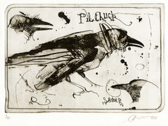
Pilchuck Raven by Rick Bartow, lithograph on Mitsumata Paper, 3/10, Wiyot, 15”h x 11”w, (2010). Collection of E. J. Guarino. Image courtesy of the Froelick Gallery, Portland, OR.
Pilchuck Raven was produced in 2010 during a residency at the Pilchuck Glass School in Stanwood, Washington. Like the crow, ravens have consistently been subjects in Rick Bartow’s art. This intelligent creature is, like the crow, regarded as a mischievous trickster but in the stories of many Northwest Coast tribes is also the bringer of light to humanity.
Across the raven’s head in the print, there are marks that look as if the artist was trying to cross out the image. This is something that Bartow frequently did. Why he did so remains a mystery open to interpretation. In addition to the central image of the raven, the print also includes what are, in essence, two small studies: a raven’s head in the upper lefthand corner of the page and in the lower right-hand corner the head of what might be a raven or, more likely a jay, which is in the same family. The print also contains loosely written letters, the word Pilchuck (a reference to where the piece was created) as well as ink dots, splats, dashes, circles, and squiggles, which give the work a spontaneous feel.

Untitled (Japanese Raven) by Rick Bartow, Wiyot, monotype, printing ink, sumi ink, 1/1, 21.5” x 39” (2003). Collection of E. J. Guarino. Photo Courtesy of the Froelick Gallery, Portland, OR.
At twenty-one and a half inches by thirty-nine inches, Rick Bartow’s monoprint Untitled (Japanese Raven) is unusually large. However, it is not only the work’s size that impresses: The raven is beautifully rendered, taking up most of the page, and the paper is covered with kanji characters. As with much of Rick Bartow’s art, Untitled (Japanese Raven) involves a mystery. In this case, it is whether the raven was drawn over the kanji or if Rick Bartow drew the bird and then the characters were drawn on top of the image. Seiichi (Seii) Hiroshima, a printmaker and gallerist with whom Bartow frequently collaborated, wrote the kanji in ink with a brush and Bartow printed over them. Bartow frequently selected paper that already had writing on it – commercial printing, printed and handwritten addresses, postage stamps, and names of galleries that represented his work. Doing so was often part of the artist’s creative process. In many cases, Bartow had little or no interest in what the pages he chose had written on them beyond their visual appeal and, in fact, he did not want to know the meaning of the kanji Seii Hiroshima wrote on the page that was to become Untitled (Japanese Raven). In fact, the kanji are upside down. What was important to Bartow was the beauty of the raven and the visual impact of the piece.
Rick Bartow had an affinity for animals throughout his artistic career, usually serving as a device allowing the artist to appear in many guises, which visualized various aspects of his character. The blackbird, crow, and raven are among those who most frequently appear in his paintings, sculptures, and works on paper. The artist’s works on paper are particularly important. It is through them that he sought to investigate line, color, shape, and texture, while probing complex and troubling subjects, including the nightmares from his Viet Nam War experiences, his struggles with alcohol, and the death of his wife from cancer. Bartow often used images of animals to do so. However, there are some who deem Bartow’s works on paper to be less significant than his paintings and sculptures. This is unfortunate since the works on paper are among the artist’s most visceral creations and deal with subjects that were most important to him as an artist. The works on paper convey an emotional immediacy and a powerful psychological impact. They are an essential part of Rick Bartow’s artistic legacy. Bartow’s works on paper are to be celebrated for their technical brilliance, striking imagery, and intellectual depth. In them, the artist explored on a more intimate scale many of the themes that concerned him throughout his career and also appear in his paintings and sculptures.
The author would like to express his sincere gratitude to Charles Froelick, owner of the Froelick Gallery, Portland, Oregon, and to Seiichi (Seii) Hiroshima for their invaluable help with this article.