Collector's Corner
ECLECTIC: One Collector’s Mindset
Jul
Although some might say that my collecting style is “all over the place,” I prefer the term eclectic since it definitely reflects who I am. I’ve even furnished my home in this manner, much to the chagrin of my mother who was most definitely a traditionalist when it came to decor. Although I also collect Native American and Inuit works on paper, I still consider Native ceramics, particularly those from the Southwest, to be the heart of the collection. I must admit that in recent years I have acquired less pottery than I would have liked, but that is only because of space limitations. Whereas works on paper can be put in archival boxes that can be hidden away, three-dimensional pieces such as pottery are more problematic when one lives in an apartment, even a large one. At this point, I have pottery lined up against one wall on my living room floor because all other available space is taken. Nonetheless, I never seem to be able to resist exquisite ceramic work.
As a collector, I never know what will pique my interest. It might be a classic piece by Lucy Lewis or Maria Martinez, or it might be a wildly contemporary piece. These days, I must admit that I am most often attracted to works that, in some way, push the boundaries of Native American art in new and exciting ways. Six of the most recent additions to my collection certainly do so.

Canteen in the form of an ear of corn by Christine Nofchissey McHorse, Navajo, hand coiled micaceous clay, incised with kernels and husk, stopper is carved from wood, traditionally fired and signed on the neck App. 2.7”w x 11.5” w/ stand, 12.5”h w/stand (1990s). Collection of J. Guarino. Image courtesy of King Galleries.
Christine Nofchissey McHorse was one of the most innovative and daring contemporary artists. Although she also created works on paper, she was predominantly known for her avant-garde ceramic works, many of which were sculptural in form and unlike anything previously produced by a Native American artist.
McHorse transcended traditional Navajo pottery, which was utilitarian, creating vessels that have a stunning abstract, sculptural quality. Each of her pieces, especially those created in the last years of her life, is mysterious, sensuous, stylized and abstract. Although McHorse worked in relative isolation from contemporary mainstream ceramic art, she invented forms that have been compared to the work of Constantin Brâncuși, Jean Arp, and Antonio Gaudí. Christine McHorse was able to blend Diné (Navajo) and Pueblo aesthetics with her personal artistic vision to create uniquely contemporary pieces inspired by spirals and a diversity of organic forms. Although her pieces may appear simple, they have a powerful impact. At once minimalist and extremely sophisticated, each of her creations has a tactile quality, so much so that one is severely tempted to touch them. Her canteen in the form of an ear of corn is a case in point.
Hand-coiled using micaceous clay and fired traditionally, the cob is incised with kernels and husk and has a stopper carved from wood. Christine McHorse made a number of these ceramic corn pieces and they are so exquisitely made that one has to overcome a strong desire to handle them as one would with any ear of corn. I have always considered corn and corn plants to be beautiful so there was no hesitation on my part in acquiring this piece. Corn was and is an important and essential crop in much of Native America. It symbolizes life, abundance, and fertility.
 |
 |
 |
 |
No.27 by Joseph Namingha, Hopi-Tewa/Zuni, 7.25 x 7.25”h, (2022). Images courtesy of King Galleries. Four views of Joseph Namingha’s No. 27.
At just 23 years of age, Joseph Namingha creates stunningly idiosyncratic ceramic works. He hails from a family of artists, including his parents noted ceramic artists Les and Jocelyn Namingha. Joseph Namingha’s pottery designs are often inspired by comic book imagery and techniques. The title of the piece I acquired by this young artist is No. 27, which is an allusion to the first time Batman appeared in DC Comics. One of the many interesting aspects of this piece is the almost imperceptible dots Namingha uses to create much of the imagery. These dots are a direct reference to those found in the drawings produced for comic books and reproduced within their pages. They are based on Ben-Day dots, common in color comics of the 1950s and 60s, which economically created shading and secondary color. These dots get their name from Benjamin Henry Day, a 19th-century illustrator and printer. Originally, comic books were printed on a four or five-color newspaper press, using inexpensive newsprint paper. Most were printed in spot color, a process whereby the graphic elements are printed in “spots” one color layer at a time. Typically, these dots were cyan, magenta, yellow, and black and were used to create color and darkening effects. Pop artist Roy Lichtenstein used stencils to mimic the appearance of Ben-Day dots in many his of his paintings.
At first glance, one is struck by the various disparate elements that make up No. 27 and it would seem that they would not work as a whole. However, they most certainly do create, a fascinating whole.

The bottom of Joseph Namingha’s No. 27. Image courtesy of King Galleries.
Most people never think to turn over a pot, which is unfortunate since they often miss a design that was hidden in plain sight if only they had taken the time to look. This is exactly the case with Joseph Namingha’s No. 27.

Gan tile by Jason Garcia, Santa Clara Pueblo, 6.5” x 9” (2022). Collection of E. J. Guarino. Image courtesy of King Galleries.
As soon as I saw Jason Garcia’s Gan, I knew this tile was something special. Although I already had examples of Garcia’s tiles in my collection, I felt that this piece was unique. According to Charles King, owner of King Galleries, “This clay tile . . . is inspired by the Indigenous comic book series, Tribal Force. The figure is ‘Gan,’ which was inspired by the Apache Ga’an dancers. There were four different superheroes who were part of the Tribal Force (Gan, Earth, Little Big Horn, and Thunder Eagle”). Tribal Force was the first comic book series to have all Indigenous superheroes and was published in 1996. The figure here is painted with natural clay slips surrounded by Jason’s signature clouds on the sides. It is a strong and exciting piece. The tile is signed with his Tewa name, Okuu Pin, which means Turtle Mountain. The tile is hand-built from native clay, all of the colors are derived from Native clay and it is traditionally fired.”
The figure of Gan wears a black superhero costume emblazoned with four lightening-like orange arrows. Gan also wears orange gloves and boots. His head and face, like his body, are covered and the eye sockets are white. In each hand Gan wields what appears to be a wooden weapon with a green arrow-like design, reminiscent of the painted wands carried by Apache Ga’an dancers. These weapons emit a powerful force represented by the color pink. On each side of Gan are Jason Garcia’s signature clouds, this time black and outlined in brown. Gan has the stance of a warrior and boldly confronts the viewer. It is one of Garcia’s most powerful images.
 |
 |
 |
|
Thirty Piece “reconstructed” pottery vessel by Nathan Begaye, Hopi/Navajo, 6”w x 11”h (1998). Collection of E. J. Guarino. Images courtesy of King Galleries.
Since the first time I saw one of Nathan Begaye’s “reconstructed” vessels I have wanted to add one of these unusual ceramic works to my collection. Recently, when the opportunity finally presented itself, I did not hesitate. Many purists do not know what to make of this aspect of Begaye’s artistic output, but I find it intriguing. As an artist, Begaye was exploring just how far he could push his medium. He was also deconstructing notions of what exactly constitutes Native American pottery. Nathan Begaye’s reconstructed works were coil-built, then broken and each section was either painted, designed, or fired differently. I emailed Charles King and asked him exactly how Nathan Begaye created his reconstructed vessels. He wrote back, “He would make a piece, then brake it before he fired it and fire the sections separately. I think more often, he would either fully fire or bisque (low) fire the piece, then break it, then paint each section separately and then fire them. I think the second option allowed him to sand the edges, etc., and still get a good fit as there was an initial firing to harden the clay. As for putting them together, he just glued them! Sometimes well and usually you can still see some of the glue he used. It was just a clear glue.” Exactly where Begaye got the idea of a ceramic vessel made up of shards is a bit controversial. Garth Clark, art critic, art historian, curator, gallerist, writer, commentator, and preeminent specialist in modern and contemporary ceramic art, wrote the following about Nathan Begaye’s reconstructed vessels in his 2006 book Free Spirit: The New Native American Potter, “In part, this use of the shards seems to be a homage to the fragmented art of Rick Dillingham, the Anglo dealer, and Santa Fe artist (and author of Seven Families in Pueblo Pottery), who was much revered by Native potters. But Begay contests this. He and Dillingham only met once. Begaye sees his shard work as autobiographical: each piece is like a page from a family album, taking him back to this recurring childhood dream of shards popping out of the ground.” According to Nathan Begaye his reconstructed vessels are the fragments from his dreams. Many of these works have intentionally missing pieces, little empty spaces. Begaye stated that they are a metaphor for himself.
Contrary to what one might expect, Nathan Begaye’s reconstructed pots are highly coveted. These vessels, which the artist intentionally smashed and reassembled, may perhaps be a clever reference to the reconstruction of ancient pottery by archaeologists. Through his reconstructed pots Nathan Begaye is actually deconstructing the pottery form, which would be daring for any ceramic artist to do. However, it is even more shocking, perhaps even sacrilegious, when done by a Native potter for whom pottery making is a sacred process involving strict rules and prayers to Mother Clay. Nathan Begaye frequently paid homage to tradition in his art while at the same time thumbing his nose at it.
Begaye worked in a variety of styles and took inspiration from any and all sources. His pots are most often asymmetrical and may or may not be painted since he is more interested in form than in design. Collectors find Nathan Begaye’s work exciting because he was constantly experimenting and seeking new ideas. The unexpected is a hallmark of his art.
The reconstructed pieces created by Nathan Begaye have come to be regarded as iconic. The jar I acquired by him has an unusual shape with an undulating form. Once it was broken apart, the artist incised some areas and painted others. According to Charles King, “The painted areas include a variety of clay slips, including his very rare purple clay! The colorful areas are almost always stone polished and not matte. I remember watching Nathan paint his complicated pieces and after painting each small section, he would stone polish it! On this piece, you can see Hopi designs in various colors. Note the section that is green with the red clay and then below is a larger section with geometric designs. . . . it is pieces like this that are truly a metaphor for his life as a potter. The jar . . . is polished white and then painted with bee-weed and . . . salt fired . . . to get the coloration. . . . . Areas where the slip seems to be missing or areas that seem ‘chipped’ Nathan would often go back on these pieces and rub them or use sandpaper to make them look as if the shards were aged.” It is important to note that each of the colors Nathan Begaye employed he found on the Navajo reservation and that the reconstructed shard pieces were among the most time-consuming pieces the artist ever made.

DEATH TAXES AND THE KARDASHIANS . . . by Susan Folwell, Santa Clara Pueblo, jar: 7”w x 5.5”h; long spoon: 7” long spoon (2023). Collection of E. J. Guarino
Part of Susan Folwell’s Pop Art series, Death, Taxes, and the Kardashians . . . expresses what the artist has stated are “the three things you can always be sure of in life.” Folwell uses her ceramic pieces as a canvas on which to express her personal views, make social commentary, and launch satiric barbs. The main section of the work, the bowl, is coil-built and the rim was dampened before firing, which produced a cracked appearance as if the piece had been aged. The outside of the bowl is painted with acrylic blue paint overlaid with many colorful dots, while the interior is a deep red. The accompanying spoon is painted to match the bowl. About this piece, Charles King commented: “Susan’s pottery is meant not only to connect with us visually but also with touch and is meant to make us think. Her innovative style of painting and pottery forms continue to break barriers within the Pueblo pottery world.”
When I first encountered Susan Folwell’s art, especially her satiric pieces, I immediately realized that here was an artist who did not slavishly follow only one style or form and was willing to create erotic as well as socially and politically provocative works. To this day, her work continues to excite me and never disappoints.

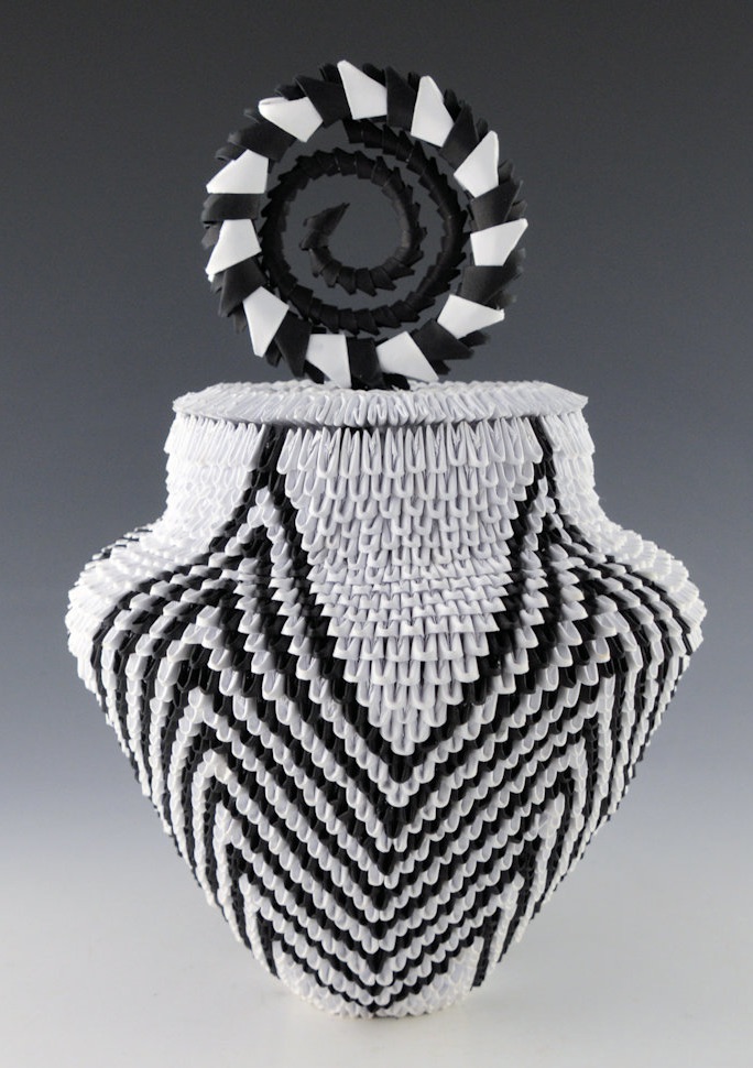
Constellation micro-origami lidded jar by Rain Scott, paper, Navajo, 7”w x 10.5” h with lid (2023). Collection of E. J. Guarino. Image courtesy of King Galleries.
Rain Scott is part Navajo and part Acoma. From an early age, he had an interest in painting and still-life drawing. When he was thirteen years old, he developed an interest in Japanese origami and Acoma pottery. In the course of the next few years, although both the Navajo and Acoma have strong pottery traditions, Scott tried without success to find someone to teach him the skills necessary to create pottery,. Rather than giving up, he used his basic knowledge of traditional Acoma ceramics and his skill for creating origami to create dazzling works of paper employing Acoma forms and colors. He experimented with his new idea for five years, eventually creating his first origami vessel in 2018 in the shape of a white corrugated Acoma pot with a rounded shoulder, short neck, and black rim. Since then, Rain Scott has continued to merge traditional Acoma pottery styles with origami. Scott singlehandedly created a new Native American art form, which he calls “contemporary indigenous origami”. Charles King wrote the following about this piece: “The thick, sturdy walls and corrugated texture of his origami pottery make every piece pleasing to the eye and gratifying to touch. He pushes the boundaries further with every art piece he creates, incorporating new designs, shapes, colors, and components, including parrot feathers, turquoise, and natural sinew.”
The first time I saw one of Rain Scott’s incredible pieces, I knew that his work would be a perfect fit for my collection since it combined elements of pottery and works on paper, both of which I’ve been collecting for years. However, in every instance, each piece that interested me had been sold before I could claim it. Then, in early 2023 I spotted Scott’s Constellation and I jumped into action (well, metaphorically speaking, that is). Charles King informed me that this was only the second jar shape that Rain Scott had made using smaller pieces of paper, making it a “micro origami” jar. “Because this piece is made up of smaller pieces of paper, there are MORE used to make the jar, but also a much tighter visual design,” King further explained. “The jar has a star pattern on the outside and also when looking down into the piece, while the lid is the comet spiral using pieces of paper in various sizes to create the spiral. The entire piece is made from thousands of individual pieces of black and white paper.”
Although I veer from classic ceramic works to cutting-edge contemporary pieces and back again, I never do so on a whim and it is never based on an artist’s name. In fact, many of the pieces I have collected were acquired when an artist was in the beginning or emerging stages of his or her artistic career. Simply put, I either like a piece or I don’t. Often, at first, I don’t know why it is that I am drawn to a particular work of art and only later, upon reflection, do I figure out what it was that originally drew me to it. To fall back on a cliché, either a piece speaks to me or it doesn’t. Given who I am, my first response to a piece is intuitive and emotional and I am fine with that. It has worked for me for almost forty years of collecting.
FURTHER READING:
Free Spirit: The New Native American Potter by Garth Clark (127 pages). The book has sections on Nathan Begaye, Susan Folwell, Christine Nofchissey McHorse, Virgil Ortiz, and Diego Romero.
Seven Families in Pueblo Pottery by Rick Dillingham (112 pages). Represented are the Chino and Lewis families of Acoma, the Nampeyos of Hopi, the Gutierrez and Tafoya families of Santa Clara, and the Gonzales and Martinez families of San Ildefonso. The book was published to accompany an exhibit at the Maxwell Museum of Anthropology
Fourteen Families in Pueblo Pottery by Rick Dillingham (309 pages.) This updated and enlarged version published twenty years after Dillingham’s 1974 Seven Families in Pueblo Pottery, includes the original seven families, plus the Chapellas and the Navasies (Hopi-Tewa), the Chavarrias of Santa Clara Pueblo, the Herrera family of Cochiti Pueblo, the Medina family of Zia Pueblo, and the Tenorio-Pacheco and the Melchor families Santo Domingo Pueblo.