 Archuleta, Mary Ester - 12" Tall Jar with Carved Butterflies (1970s)
 Collector's Corner
FUTUREWORLD: Five Young Ceramic Artists of Note
Feb
Collecting is a learning process, or it should be, in my opinion. In order to remain relevant, collectors and collections must continually evolve. Although, over the years, I have acquired many different types of Native art, I began with pottery and, though I am fast running out of space, I still can never resist an exceptional piece of ceramic art. In the beginning, I only collected pottery from Acoma Pueblo. Try as she might, Betty Johnston, the first mentor for my collection and owner of Speaks of the Earth, couldn’t get me to see beyond that one collecting area. Eventually she did, however, but Betty was a traditionalist and I tended to follow in her footsteps. All that was to change when I saw the first installment of “Changing Hands: Art Without Reservation,” curated by Ellen Taubman and David McFadden. That one exhibition changed the course of my collecting forever. Needless-to-say, the two subsequent exhibits in the series also introduced me to art and artists that were totally new to me at the time. Many of the artists in “Changing Hands” are now in my collection and some have become friends. Because of those three exhibits I became open to new perspectives in Native art, ceramics in particular. If not for “Changing Hands: Art Without Reservation,” I doubt the work of Jody Kaa-Folwell, Christopher Youngblood, Joel McHorse, Eric Lewis and Jonathan Naranjo would have attracted my attention.
__________________________________________
 |
 |
| (Traditional view) | (Non-traditional view) |
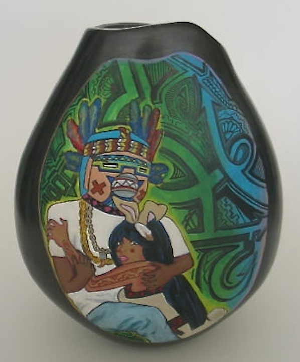
Dawnee Darko and Rez Bunny: Forbidden Love by Kaa Lazaro-Folwell, Santa Clara, acrylic paint,
9“ h x 22“ in circumference (2014). Collection of E. J. Guarino
Before I even knew its title, I took one look at Dawnee Darko and Rez Bunny: Forbidden Love and instinctively knew it was an important piece. I have been following the work of Kaa Lazaro-Folwell for a number of years and it has been wonderful to see her develop as an artist. She has blossomed under the mentorship of her grandmother, Jody Folwell, her aunt, Susan Folwell and her mother, Polly Rose Folwell. In an Email interview, Ms. Lazaro-Folwell explained the title: “I spell it Dawnee because it rhymes with Pawnee even though the Pawnee Nation doesn’t have a belief system around katsinas . . . . It’s just the Native version in my mind of Donnie [Darko]. My grandmother has a Hopi katsina that I modeled the Dawnee mask after.”
When asked about the inspiration for the piece, the artist stated, “I was having dreams of my current boyfriend while I was in my previous relationship. Neither of us acted on our feelings because my ex-boyfriend and my present one are friends so it was jut a very taboo thing for us to have feelings for each other. . . . in Tewa belief women aren’t supposed to touch katsinas and vice versa. Dawnee and Rez represent forbidden love . . . it’s the whole look but don’t touch concept. “
The background is based on graffiti designs, adding to the tension of the piece. “The background colors,” the artist continued, “also represent a lot as well. The yellow and green are supposed to show how Dawnee and Rez admit light while together. You can see blue fade into green, which represents the possibility of a fresh future . . . .”
Ms. Lazaro-Folwell clearly knew that her piece was controversial for a number of reasons in addition to the katsina and female embracing. Rez Bunny sports a tattoo on her arm, something frowned upon by the elders of Santa Clara Pueblo. “Both Dawnee and Rez” the artist added, “are also bringing the traditional and the modern together. You can see this with Dawnee’s attire and with Rez you see the pink lipstick and the red tattoo and nails. The actual vessel can be viewed two different ways: traditional and contemporary. To get the traditional view, turn the side with the imagery to the wall. I knew while I was building the pot that I wanted it to be versatile in viewing . . . . Again, this goes along with the new and old, the ‘traditional and contemporary.’”
__________________________________________________
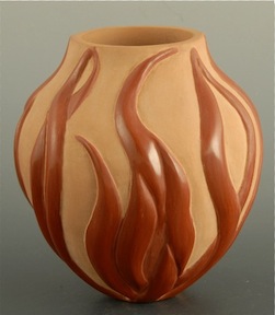
Wild Fire, jar with fire and flames by
Christopher Youngblood, Santa Clara, 4”w x 4.5”h (2013). Collection of E. J. Guarino
Christopher Youngblood has a very different perspective. As soon as I saw Wild Fire at King Galleries I knew it was unique and definitely saw it as a contemporary piece. Mr. Youngblood has a different view with regard to his work. “Some people refer to my designs as contemporary,” he stated in an Email interview, “but I strongly disagree. The definition of traditional and contemporary should only apply to the materials and techniques used to create pieces of pottery, not the designs used. My designs are representations of what I see and feel.”
As a collector, I found Wild Fire to be spectacular. I had never seen anything quite like it and wondered what had inspired the artist to create such a striking work of art. “The piece that you have in your collection,” Youngblood continued, “is the first of what I like to call Wild Fire. I first got the idea for making that piece from all the wild fires we have every year in New Mexico. I made earlier pieces depicting mountains and fire but never a piece that depicted the fire itself. I love the piece because the flames are like melon ribs and the matte area is sanded to give it that buckskin look.”
After acquiring Wild Fire, I saw a number of other pieces by Mr. Youngblood and was impressed that each was unique and visually striking. Clearly, he is someone who has a strong sense of himself as an artist so I asked him what he wants people to know about his art. “I strive to keep traditional pottery alive,” he said. “By this I mean using all the techniques and methods taught to me by my mother and my family. We do not buy our clay; we dig it ourselves. We use woodcarving tools to carve the designs. We also hand polish without the use of any non-traditional materials. We fire using traditional techniques rather than a kiln. We are proud of the traditional techniques and . . . strive to keep them alive.”
______________________________________________
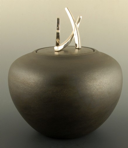
Three Fingers by Joel McHorse, black micaceous pot with silver finial comprised of three
rectangles, Navajo/Taos, 8.5”w x 10”h with lid (2013). Collection of E. J. Guarino
At the same time I became aware of Wild Fire, I also saw Three Fingers by Joel McHorse. Once again, I knew I had encountered something unique. The piece exudes refined elegance. I did, however, wonder about the unusual title. In an Email interview Mr. McHorse said, “Odd name, I know. Most times you are pressed and need to make decisions about names. This piece is one of my favorites. For me it serves as one of several pinnacles of my design ideology. . . . I see it as encompassing the elegance of Asian Design. Having traveled to and through Southern China for three months and Japan for one month, these memories are a part of me. . . . The simple and subtle curve of a blade of grass; add another and you have a relationship; add a third and you have movement, a dance, a party. Originally, I had the sterling silver handle of Three Fingers on a smaller piece of black micaceous pottery, perhaps six inches across. The presence of the handle overwhelmed the small piece. So I made a larger bowl and lid, making it a complimentary scale for the elements atop. . . . I enjoy the naming process, and for me it is never really complete. I could refer to Three Fingers as Fat Grass, The Three Graces . . . or French Fries, which was the first thing that jumped to mind when I had to discuss it with others. I do enjoy Grace, Harmony, or anything that speaks to the balance or subtle relation of the three elements. I am tempted to let you name it, since you appreciated it enough to add it to your collection. No one could argue the difference. And I wouldn’t either if the name spoke to elegance, peacefulness, and refinement.”
Mr. McHorse takes his creative process very seriously. It is something he clearly thinks about often, especially with regard to the combination of clay and silver but his relationship to each of these elements is different. With regard to working with the clay, he stated, “ . . . my process is more intuitive. I like to work in a free form fashion. . . . I have to let the clay do what it needs to do. . . .” However, the creating of a ceramic form is only part of McHorse’s art. “The silverwork is a different story,” he continued. “I feel like I am in control, creating some very elegant and complicated designs which match any conceptual sketches or models I have designed. The sterling silver is so beautiful that it is hard to create something ugly. . . . . The silverworks on my pieces are fun and expressive. Regarding Three Fingers, I carved two forms into a piece of tufa stone and cast two of one and one of the other. . . . I have described the lidded bowls as pedestals for the sterling silver constructs. And I have said that the silver compliments the ceramic form. And again, I have said that the silver accents the black micaceous potter; subtle but worlds apart. I guess it depends on the presence that both materials command when they are married. . . . The first time I placed sterling silver against a piece of micaceous pottery I knew I would continue to play with the combination. I liken it to a tuxedo: silver on black.”
Mr. McHorse is particularly passionate and eloquent about the micaceous clay he uses. “I do believe our clay, with natural mica within, is a most beautiful surface. If anything imitated the night sky, it would be our pottery in finished form, fired black. . . . When I say ‘our’ I mean potters using micaceous clay: the Pueblos, the Navajo, the Apaches, the Spanish and the Anglos. . . . .”
Mr. McHorse is equally committed to the creative as well as practical aspects of his art. In his case it is doubly complex. In order to produce his visually elegant pieces McHorse had to master the intricacies of pottery making as well as the technicalities of metalworking. Three Fingers is a testament to his having done so.
________________________________________
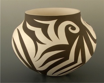
Jar with cloud/rain design by Eric Lewis, Acoma, 7.25”w x 6”h (2013). Collection of E. J. Guarino
Despite creating ceramic art with visually spectacular designs, Eric Lewis didn’t start making and painting pottery until 2010. I first saw his work at the 2012 Heard Indian Market and was intrigued. His designs seemed familiar and yet totally new. Mr. Lewis works in a variety of ceramic forms – pots, jars, seed pots and tiles – that are covered with bold black-on-white designs that some have likened to Virgil Ortiz’s “tattoo pots” and, as is customary with Acoma pottery, they are eggshell thin.
In an Email interview I asked Mr. Lewis how he came up with the imagery he uses on his ceramic pieces. “Doodling the same design over and over in my spare time gave me ideas for my first designs,” he said. “This is still how I make up new designs. They really don’t have any special meanings. They’re just what I like when I look back on my doodles. I practice drawing designs on copy paper. I save all the pages and sometimes look over them for new ideas. I use a pencil to first draw the design on the pot.”
Using his ceramic pieces as his canvas, Mr. Lewis covers them with striking abstract designs that seem to swirl like great black clouds. One has the impression that classic Acoma imagery has been boldly enlarged, creating a dazzling effect. In fact, much of Mr. Lewis‘ work is reminiscent of Dorothy Torivio’s “eye-dazzler” pieces although the graphics she employed were much smaller.
I mentioned to Mr. Lewis that I had come across statements that his designs were based on traditional Acoma cloud, rain and bird patterns. “I’ve read those statements before, too,” he replied. “I can see how people would see that, because my designs are based on older ones which represent natural things, but I’m not fully aware of all the symbology and what means what. I just design what looks pleasing to me.”
_____________________________________________________________
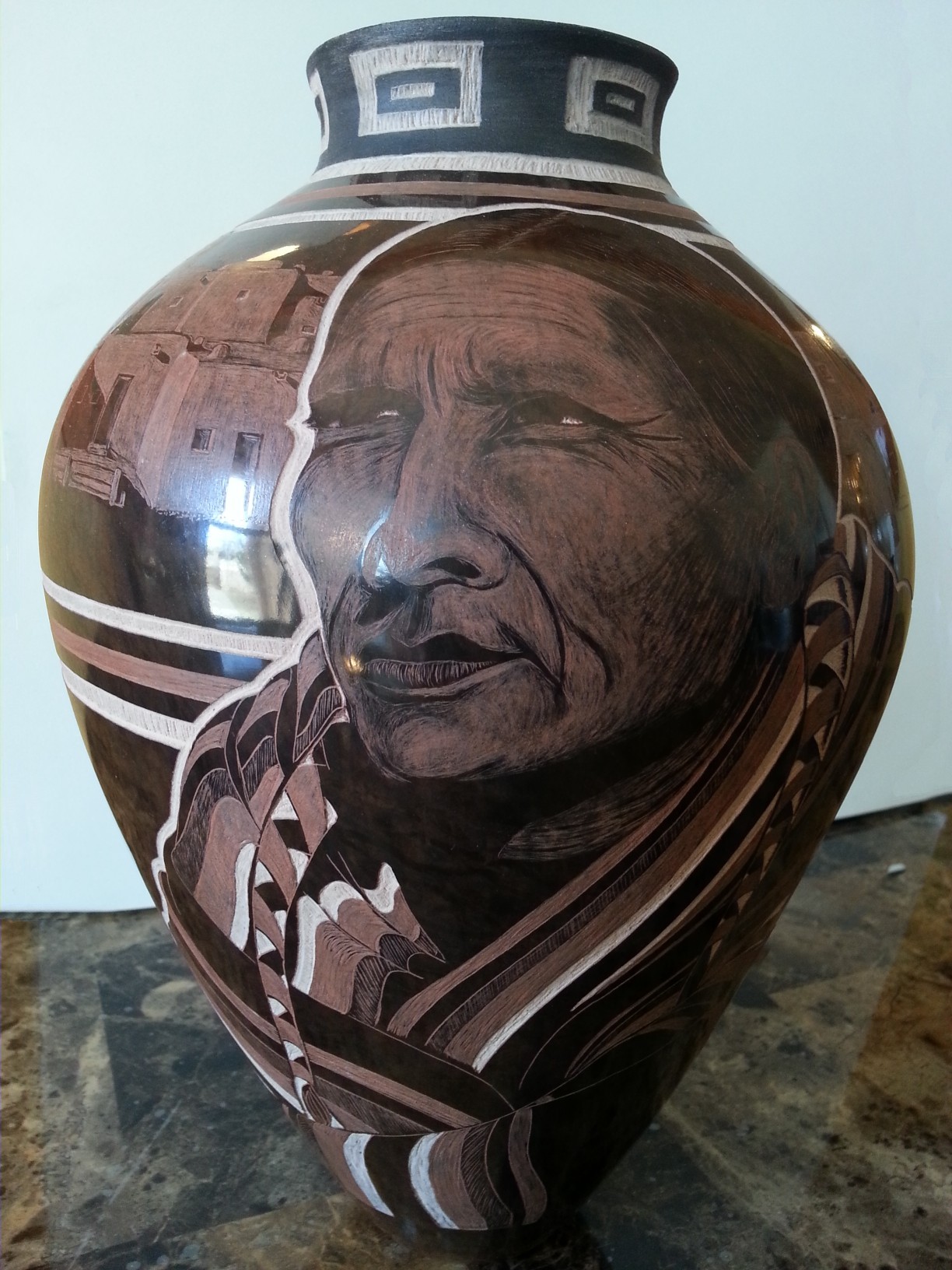
Grandfather by Johnathan Naranjo, Santa Clara, 8.5”w x 15”h (2013-14). Photo courtesy of the artist.
I first became aware of Jonathan Naranjo’s work at the 2013 Heard Indian Market and I’ve been an admirer ever since. I saw Mr. Naranjo again at the 2014 Heard Market and stood looking in awe at a piece he called Grandfather, which bore a lifelike portrait. The image was so perfect that, at first, I wondered how he had managed to get a photograph onto a piece of pottery. It was only after I saw him delicately carve into the piece that I realized that the likeness had not been
produced by a photographic process. I was truly amazed. Mr. Naranjo explained that this stunning piece was made with Santa Clara Pueblo clay, a mixed red rock slip, a polishing stone, and an X-ACTO blade. According to the artist, the clay is gathered at Santa Clara Pueblo and then each piece is hand formed using pinch and pull techniques. It is then sanded and smoothed, polished with a stone, pit fired for dark colors, and designed with the sgraffito technique using an X-ACTO knife.
In all of his work, Mr. Naranjo’s etching is extremely fine and each piece, usually brown in color, is buffed to an amazingly high polish. In addition to portraits of Pueblo and Navajo people, the artist often creates works with images of katsinas and figures from other Pueblo ceremonies. Many of his pieces reflect an interest in Nature and have flowers, dragonflies, butterflies, bears or horses etched into them. Mr. Naranjo also often incorporates abstract geometric designs into his creations.
When asked about his art in an Email interview Mr. Naranjo said, “My artwork is derived from techniques that were passed down to me by my grandparents, their grandparents, and many generations before them. My mission is to blend the times then with the times now. You’ll notice my sgraffito technique is completely different from the rest. My imagery can either be as real as I can make it, or another day be playfully animated. That is the beauty of art, the ability to create and affect people in many ways. I’m a Santa Clara Pueblo tribal member but what most people don’t know is that I’m also half Navajo, and one quarter Taos Pueblo. I’ve seen life from different tribes and there is a prevalent influence in all my pieces from each culture. I strive to challenge myself and my abilities all the time that is why you’ll never see the same thing twice. . . . . one day I would like to be considered as one who pushed the boundaries of pottery to the next level. I’m part of the next generation of potters and it’s my duty to keep the tradition alive. ”
The future of ceramic art depends on such visionaries as Jody Kaa-Lazaro, Chris Youngblood, Joel McHorse, Eric Lewis and Jonathan Naranjo. Each of these young artists has a distinct voice and a strong sense of self. They know who they are and where they are going creatively while at the same time mindful of the traditions that preceded them, which each of these artists honors in a unique, contemporary way.