Collector's Corner
THE LOST LANGUAGE OF FLOWERS: Floral Imagery in Rick Bartow’s Works on Paper
Nov
Flowers speak to us in many ways; they have a language all their own. For thousands of years, meanings have been associated with various flowers. They were used as symbols in the Old Testament, in noble coats of arms as well as in Shakespeare’s plays. Known as floriography, the language of flowers peaked during the Victorian era when they were employed to send messages. A single red rose meant (and still does) “I love you”; the spider flower said, “elope with me;” and the sweet pea signified “goodbye”. Although, for the most part, the floral symbolism of the Victorians has been lost, we continue to respond emotionally to flowers perhaps because their life cycle resembles our own. The planted seed signifies conception; the budding flower – youth; the wilting flower – old age; and the dead flower – mortality. When we see a flower, no matter what stage it is in, it intuitively means something to us. Rick Bartow was clearly aware of this and produced many works on paper that employ floral imagery. In these works, Bartow wished to create something more than simple flower portraits. He wanted to evoke an emotional response from the viewer.

Flower 100 (Amaryllis) by Rick Bartow, Wiyot, mixed media on found paper, gouache, ink, graphite on antique paper,13” x 9” (2000). Private Collection. Photo courtesy of the Froelick Gallery.
Until recently, works by Rick Bartow that had floral imagery held no interest for me, which is odd since I very much like flowers. Over the years, I looked at many works by the artist and added prints that covered a wide variety of themes and subjects, but not flowers. Not long ago I saw Flower 100 (Amaryllis), which was a revelation. Looking at it, I realized that it was not simply a representation of a particular flower. The amaryllis that Bartow drew has fallen over. It is not in the full flush of its boom, which gives the work a melancholy tone. Looking at it, the viewer can’t help thinking of it as a symbol of life’s later stages. The muted colors the artist employed add to this impression.
Bartow often drew imagery on paper that already contained printed words or images. It was something he did as part of his artistic process. According to Wilder Schmaltz, Assistant Director of the Froelick Gallery, the fine handmade Japanese paper that the artist used frequently had a previous life as commercial wrapping paper. Flower 100 (Amaryllis) was drawn on just such paper. In addition, the artist wrote the word amaryllis on the page. Bartow often added words in his own hand to works on paper.
Although I was much taken with Flower 100 (Amaryllis), it had already been sold to another collector. Charles Froelick then sent me works in a similar vein that I would not have seen had Flower 100 (Amaryllis) been available. From numerous choices, I selected Flower 104: Kimpai Nama Zake, Dandelion I, The Fall, and The Last Rose of Summer II.

Flower 104: Kimpai Nama Zake by Rick Bartow, Wiyot, gouache, graphite, ink, and collage on paper, 15 “x 6” (2000). Collection of E. J. Guarino. Photo courtesy of the Froelick Gallery.
I was drawn to Flower 104: Kimpai Nama Zake for a number of reasons. First, it has the same melancholic quality as Flower 100 (Amaryllis). The flower, most likely a sunflower, and its leaf have wilted and look almost dried out, which evokes a pensive response in the viewer. Also, the artist fashioned the work out of two pieces of paper he glued together, something he often did, which is quite interesting. The lower section has a stamp on it, indicating that the paper had been repurposed. I emailed Charles Froelick about this aspect of the piece and he wrote that Bartow “. . . always cobbled things together – sculpture, for example, but he also patched papers together for a variety of projects over the years.”
On the upper sheet, Bartow wrote in pencil “Kimpai Nama Zake” and “11 Aug. – 10 PM – 12 AM Final Exam.” The time and the date were probably when Bartow created the work. However, I was curious about what the Japanese words meant. Charles Froelick explained: “Nama means ‘fresh’ and Namazake is considered the most special sake. Unpasteurized, it’s a seasonal specialty, often only available when visiting a sake brewery or made by homebrewers. It must be consumed within a few weeks of production.” What connection this sake has to the work remains elusive.

Dandelion I by Rick Bartow, Wiyot, ink, gouache, graphite, on paper, 18” x 12” (1994). Collection of E. J. Guarino. Photo courtesy of the Froelick Gallery.
Dandelion I is another work in which Rick Bartow employs muted colors to convey an emotional tone. The paper on which the artist drew the image has a grayish cast to it and the predominant colors of the work are browns and tans. Rather than portray the flowers in their early, bright yellow stage, Bartow chose to create a work in which the flowers are at the end of their life cycle. At this stage, dandelions have very small flowers grouped together into what appears to be a single flower. Each of the tiny single flowers is called a floret. When the dandelion is at this phase it has become a custom to blow out the dandelion seed head and make a wish. The flowers in Dandelion I are a metaphor for the later years of life. Because these plants can survive in difficult conditions they have also come to symbolize survival. However, since they are most often considered a weed, dandelions were not part of the Victorian language of flowers. Although today the dandelion is still considered a weed, in it’s yellow stage it symbolizes happiness, and dandelion leaves are part of many cuisines.
Rick Bartow also included one of his iconic trademarks in Dandelion I – mark-making, as he referred to it. Bartow often added numbers, letters, words (in English and other languages) as well as a diverse range of curious marks to his works on paper. Those in Dandelion l include a line of crosses, a circle with an X through it, a V in a circle, the number 34, and the artist’s signature. These symbols, letters, and numbers impart a sense of spontaneity and mystery to the piece.

The Fall by Rick Bartow, Wiyot, drypoint etching on handmade Japanese paper, ed. II/X, image size 9” X 8”; paper size 24” x 13” (2000). Published at Moon & Dog Press, Tokyo, and South Beach, OR. Collection of E. J. Guarino. Photo courtesy of the Froelick Gallery.
According to Charles Froelick, The Fall exists in two different states. “Early on,” he stated, “Rick and [master printmaker] Seiichi [Hiroshima] often printed two separate states of many plates: for general example approx. 8 to 12 impressions of black ink on Mitsumata paper; then another set of about 8 to 12 impressions with different ink/paper – Gampi paper with brown ink. This is one of those works; one state is numbered in Arabic, the other in Roman. Both editions were made on beautiful handmade Japanese papers, seem to both be black ink.”
The Fall is another Bartow work that has a melancholic tone. The title of the work most probably refers to the fall season, but it may simply denote the state of the flowers in the bouquet, many of which appear to be withered and to have fallen over. The title might also be a subtle Biblical reference to Adam and Eve’s fall from grace in the Garden of Eden.
The image of the bouquet is oddly placed on the page, something that Bartow occasionally did. The flowers are confined to the top two-thirds of the paper, while the bottom third is left empty. Also, the flowers and the vase are framed by black lines. The strangest aspect of the work, however, is that one of the stems sprouts an eye rather than a blossom. This is an homage to the artist Odilon Redon who is, perhaps, best known for his dreamlike, often nightmarish imagery. Like Bartow, he was influenced by Japanese art. Although he was inspired by Nature, Odilon Redon often created works that veered into abstraction and he produced imagery that would later be termed surreal. Eyes feature prominently in Guardian Spirit of the Waters (1878), Eye-Balloon (1878), Caliban (1881), The Eye Like a Strange Balloon Mounts Toward Infinity (1882), The Cyclops (1914), and many other Redon works

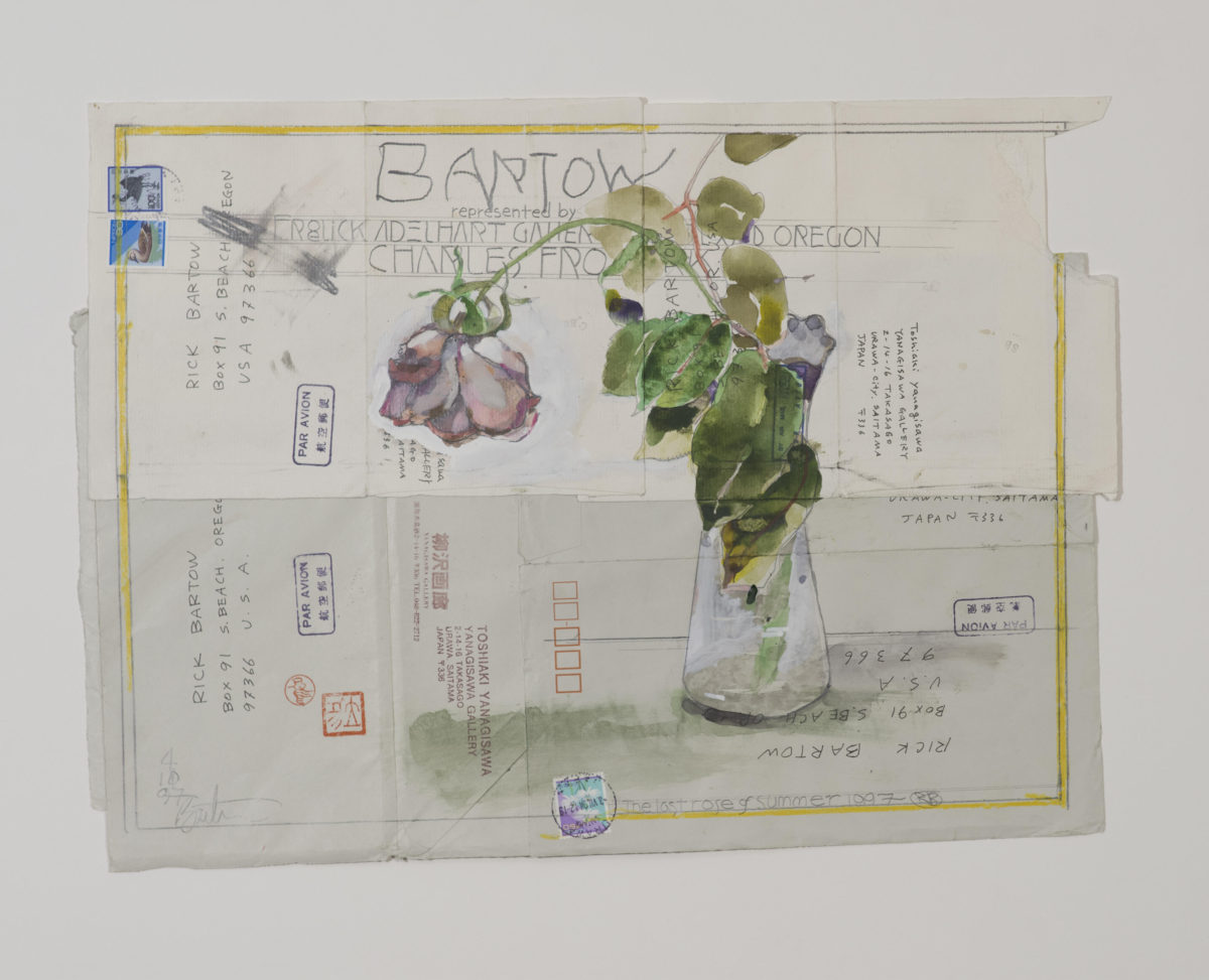
The Last Rose of Summer II by Rick Bartow, Wiyot, graphite, gouache, ink on envelopes, (1997). Collection of E. J. Guarino. Photo courtesy of the Froelick Gallery.
As soon as I saw The Last Rose of Summer II, I knew I wanted to acquire it because it embodies so much of what was a part of Rick Bartow’s process: a strong image overprinted and handwritten words, repurposed paper (in this case envelopes) cobbled together (as Charles Froelick said), and the artist’s name printed in his own hand. The work also contains stamped French words and Japanese kanji characters, printed and handwritten addresses, postage stamps, the name of the gallery that represented the artist at the time – the Froelick Adelhart Gallery – and Charles Froelick’s name. It is a veritable Bartow bonanza.
The phrase “the last rose of summer” has come to signify getting older, watching friends and family die, and being the last survivor – the last rose of summer.
Rick Bartow’s title may also be alluding to Irish poet Thomas Moore’s poem “The Last Rose of Summer.” Written in 1805, the work became popular around the world in the 19th and 20th centuries. Early on, the poem was set to a traditional Irish tune and has been sung by vocalists as diverse as Bing Crosby, Nina Simone, and Kanye West. Moore’s poem and its theme inspired composers such as Beethoven, Gounod, and Benjamin Britten. In Japan, Tadashi Satomi adapted the poem, and the melody he created is known as the song Niwa-no-Chigusa (庭の千草), meaning “The Plants in the Garden.” It is possible that Rick Bartow may have encountered it in this way. It is fascinating to ponder.
Over the years as I collected works on paper by Rick Bartow I tended to do so by subject or theme. One year I was interested in portraits and self-portraits; the next, I was obsessed with works that reflected the influence of Japanese Ukiyo-E prints. There were also times when I acquired works based on a particular theme such as mortality. Rarely, did I acquire a group of disparate works so perhaps it was just a matter of time before graphic works with floral imagery caught my attention.
While, for the most part, the Victorian language of flowers may be lost to us, we still use blossoms to communicate our feelings: A single red rose still says, “I love you”; a bouquet might proclaim “Get well soon” and a large arrangement might indicate “Sorry for your loss.” We react to flowers on an emotional level and always will – a flower in bloom makes us feel happy while a wilted one evokes sadness. Rick Bartow drew upon our intuitive response to flowers and created graphic works with floral imagery that are more than mere documentation. They evoke a visceral response from the viewer.
The author would like to express his sincere gratitude to Charles Froelick, owner of the Froelick Gallery, and to Wilder Schmaltz, Assistant Director of the Froelick Gallery, for their invaluable help with this article.